Sub-Total: $0.00
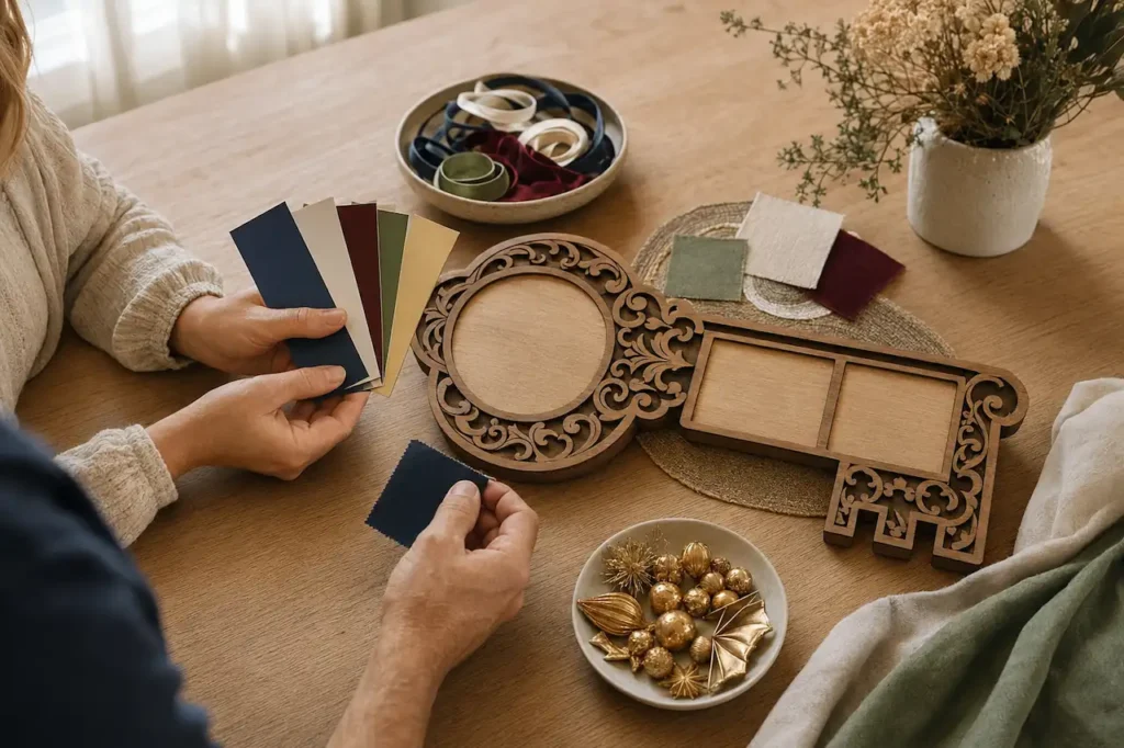
How Do I Choose the Right Colours for a Birthday Key? Most Families Get This Wrong
Colour is one of the most important decisions in the entire birthday key ordering process, and it is also the decision most families spend the least amount of time thinking about. At WoodenWares, we have seen firsthand how a strong colour choice elevates a key from beautiful to extraordinary — and how an undecided or rushed colour choice results in a design that does not fully do justice to the occasion it was made for.
The good news is that choosing the right birthday key colours Australia families will love for decades is not as complicated as most people fear. It comes down to understanding a few clear principles, knowing what the available options actually are, and thinking about the person receiving the key rather than personal preference alone. This guide walks you through exactly how to approach the decision confidently.
Why Colour Matters More Than Most People Realise
When a birthday key is displayed in a family home, it is the colour that commands attention first. Before anyone reads the name, recognises the cultural pattern, or notices the photograph, the overall colour palette is what draws the eye across the room. A key with a rich, well-considered colour scheme becomes a centrepiece. A key with a flat or mismatched palette fades into the background.
The colours also carry meaning that goes beyond aesthetics. In many Polynesian, Pacific Island, and cultural traditions, specific colours hold significance that extends across generations. Navy blue and gold together carry a sense of dignity and achievement. Deep burgundy and black convey strength and maturity. Bright turquoise and white reflect celebration, energy, and the ocean traditions of Pacific Island cultures. Choosing colours that align with the recipient’s cultural identity adds a layer of meaning to the design that no other element can replicate.
We always advise customers to think of colour as part of the message the key is sending — not simply as decoration applied after the design is complete. When the colours are chosen with purpose, the entire key reads as intentional and considered rather than assembled from available options.
The Most Common Colour Mistake Families Make
The single most common mistake we observe is choosing colours based on what the customer personally likes rather than what suits the person the key is for. A mother who loves purple orders a purple key for her son. A family with a preference for bright colours orders a vivid palette for a grandparent who would have responded more strongly to deep, refined tones.
The key is not for the person ordering it. Every colour decision should be made by asking one question — what colours reflect the personality, the culture, the occasion, and the aesthetic sensibility of the person who will display this key in their home for the next fifty years?
The second most common mistake is choosing too many colours. Our system offers 260 colour combinations, and the instinct for many customers is to incorporate as many colours as possible into the design. In practice, the most striking keys we produce use two to four colours chosen with discipline. A strong primary colour, a complementary secondary colour, and one or two accent tones consistently produce a more impressive result than a design that attempts to use every option available.
What Colour Combinations Work Best for Different Occasions
Different milestone occasions and age groups tend to respond to different colour approaches. Understanding these tendencies helps narrow down the decision significantly before the draft stage begins.
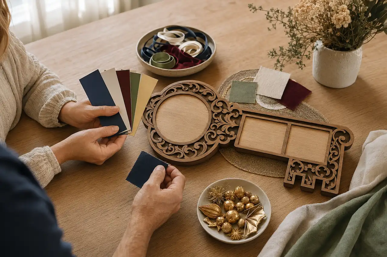
For 21st birthday keys, bold and vibrant palettes consistently perform well. Royal blue and gold, emerald green and black, deep red and silver — these combinations carry the energy and confidence that a 21st birthday represents. Bright, saturated colours work particularly well for younger recipients and read powerfully in the social celebration environment where the key is typically presented.
For milestone keys in the 50th to 70th age range, richer and more refined palettes tend to produce a stronger emotional response. Deep navy, burgundy, forest green, and charcoal paired with gold or champagne accents carry a dignity and permanence that matches the weight of an older milestone. These combinations also age beautifully in a home display environment over the decades that follow.
For Polynesian and Pacific Island cultural keys, colours drawn from the natural world of the relevant culture — ocean blues, earth tones, coral accents, and deep greens — integrate most naturally with the cultural patterns being used. To see how colour works across our full range of key designs and video demonstrations, visit our Colour Videos page which shows finished keys across every major colour family.
A Real Example — How the Right Colour Choice Changed Everything
We want to share a specific situation that shows exactly how much the colour decision affects the finished result.
A family from Melbourne contacted us for their daughter’s 21st birthday key. They submitted their initial order with a colour request for pastel pink and white — colours the mother personally loved. We completed a 3D draft using those colours and sent it through for review. The draft was technically correct but the overall result felt soft and underpowered for a 21st milestone key. The mother agreed when she saw it.
We had a brief conversation about the daughter — her personality, her cultural background, the way she decorated her own space. She was a confident, vivid personality with a Cook Island heritage and a love of deep jewel tones. We revised the draft using deep teal, gold, and black with a Cook Island pattern across the background. The difference was immediate and striking.
When the revised draft arrived, the mother replied within minutes saying it was exactly right. The key was presented at the party and the daughter cried when she saw it. The pastel version would have been a beautiful key. The teal and gold version was a key that felt genuinely made for her — because the colour decision reflected who she actually was rather than what someone else preferred.
How to Use the 3D Draft to Test Your Colour Choice
One of the most significant advantages of the WoodenWares ordering process is that you see your colour choices rendered in a fully detailed 3D preview before a single piece of material is cut. This completely removes the risk of committing to a colour combination that does not work in practice.
When you submit your order details, include your preferred colour direction — even if it is broad. Deep and warm. Bright and bold. Ocean tones. Cultural colours. We translate that direction into a specific palette for the first draft, and you review the result before approving. If the colours are not right, you request a revision and we produce a new draft with an adjusted palette. There is no charge for revisions and no limit on the number of colour adjustments before you approve.
Most customers who are uncertain about colours find that seeing the first draft immediately clarifies what they want. The draft makes the decision concrete in a way that no description or colour chart can replicate. To start your order and receive your first colour draft within 24 hours at no cost, visit our Free Quotes page and we will handle the rest from there.
How Our UV Ink Technology Affects Your Colour Choice
The colours you see in your approved 3D draft are produced on the finished key using industrial UV inks — not standard craft paint or inkjet printing. This distinction matters significantly for how colour behaves on the finished surface.
UV inks produce a depth and richness of colour that standard printing cannot match. Deep navy looks genuinely deep. Gold reads as warm and metallic rather than flat yellow. Red carries intensity without looking washed out. The finished key almost always looks richer and more impressive in person than it does on screen — which means the colour choices you make in the draft stage will look even better when the key arrives.
UV inks also resist fading over decades of display in a way that standard printing cannot. The colours on a WoodenWares key produced five years ago look identical today to the day they were delivered. This durability is a direct result of the industrial curing process that bonds the inks permanently to the key surface. To understand the full technology behind our UV ink process and what it means for the longevity of your key, visit our page on Australia’s most advanced custom birthday keys which covers every technical aspect of how we build each key.
What to Do If You Cannot Decide on Colours
Colour indecision is one of the most common reasons customers delay placing their order. The concern is always the same — what if I choose the wrong colours and regret it when the key arrives? This concern is entirely understandable for a keepsake that will be displayed in a family home for decades.
The practical solution is to stop treating the colour decision as something that needs to be finalised before you start the ordering process. It does not. You can submit your order with a general direction — deep and warm, bright and Pacific-inspired, neutral with gold accents — and we will produce a draft that shows you exactly how that direction looks as a finished design. The draft is what finalises the colour decision, not the initial submission.
If you want to talk through colour options before submitting your details — to get a sense of what works for a specific cultural background, age group, or occasion — reach out to us directly through our Contact page and we will give you a clear, specific recommendation before you commit to anything.
Why Choose WoodenWares
WoodenWares offers 260 colour combinations applied using industrial UV ink technology — producing birthday key colours Australia families are proud to display for decades without fading, dulling, or losing their original impact.
- Every colour choice is shown in a free fully rendered 3D draft within 24 hours — you see exactly how your palette looks before approving, with unlimited revisions at no charge.
- Our UV ink curing process bonds colours permanently to the key surface, making them as resistant to fading as any element of the finished design.
- Our design team works with you through the draft process to find the palette that reflects the recipient’s personality, cultural background, and the specific occasion being celebrated.
- Colour Videos on our website show finished keys across every major colour family so you can see real examples before making your decision.
- A $150 deposit secures your production slot after you approve your colour draft, with a flexible weekly payment plan available for the remaining balance.
Conclusion
Choosing the right birthday key colours Australia families will treasure is not about picking what you personally love — it is about choosing what reflects the person the key is for, the occasion it marks, and the cultural identity it honours. At WoodenWares, the 3D draft process removes all the risk from this decision by showing you exactly how your chosen palette looks before production begins. If you are ready to see your colours rendered in a full design, submit your details today and your draft will be with you within 24 hours.
Frequently Asked Questions
Q1. How many colour options are available for a WoodenWares birthday key?
We offer 260 colour combinations across our full range of birthday keys. Every combination is available for any design, any cultural pattern, and any milestone age. Your chosen colours are shown in your free 3D draft before production begins.
Q2. Can I change the colours after I see the draft?
Yes. Colour revisions are a normal part of the draft process. You can request changes to any colour element after seeing your first draft — background, pattern, text, and accent colours can all be adjusted. There is no charge for revisions and no limit on the number of colour changes before you approve.
Q3. Will the colours on the finished key look the same as in the draft?
The colours in the finished key are produced using industrial UV inks that are rich and deep. Minor variation can occur between screen display and physical UV inks depending on your device settings, but in most cases the finished key looks richer and more impressive in person than on screen.
Q4. Do the colours on a birthday key fade over time?
No. The UV ink curing process bonds colours permanently to the key surface, making them resistant to fading, environmental damage, and everyday wear. Keys produced years ago continue to show consistent colour depth identical to the day they were delivered.
Q5. What colours work best for a Polynesian or Pacific Island birthday key?
Ocean blues, deep teals, earthy greens, coral accents, and warm gold tones consistently produce the strongest results for Polynesian and Pacific Island cultural keys. These colours integrate naturally with the cultural patterns used in these designs and carry the visual weight and cultural identity that makes the key feel genuinely meaningful to the recipient.
